The Aesthetic Value of Not Knowing Where You Are
Designers have finally won their long, grueling war against the user’s ability to navigate a document. For three glorious decades, we had these hideous, chunky gray bars on the right side of our screens. They were reliable. They were static. They told you exactly how deep you were in a 400-page PDF without requiring you to perform a ritualistic mouse-wiggle first. But then, a collective epiphany struck the Silicon Valley elite: functionality is clutter. A visible scrollbar is a failure of minimalist purity. If a user can see a button, the interface isn't 'clean' enough yet.
We have traded thirty years of spatial muscle memory for the privilege of looking at a sleek, empty window. The Windows scrollbar shortcut—that magical ability to right-click a specific spot to jump exactly where you need to be—has been sacrificed on the altar of 'Modern Design Language.' Now, the scrollbar is a shy, retractable ghost. It only emerges from hiding if you hover your cursor over a specific three-pixel-wide strip of screen real estate with the precision of a neurosurgeon. It’s a fun little game of hide-and-seek we all get to play sixty times an hour.
This isn't just about aesthetics; it's about the bold assumption that users have nothing better to do than wait for an animation to finish. We’ve moved from high-speed power-user ergonomics to a world where the software treats you like a distracted toddler who might get overwhelmed if they see a scroll thumb and a track at the same time.
The Three-Pixel Precision Challenge
In the old world—let’s call it the Era of Things Working—the scrollbar was a physical anchor. It occupied a dedicated lane. You didn't have to look for it; your hand just knew where the edge of the world was. Today, that lane has been reclaimed by the 'Content-First' movement. Because, as we all know, that extra 15 pixels of horizontal space was the only thing standing between us and total enlightenment. Now, the scrollbar is an overlay. It sits on top of your text, often obscuring the very words you are trying to read, like a polite ghost that refuses to leave the room.

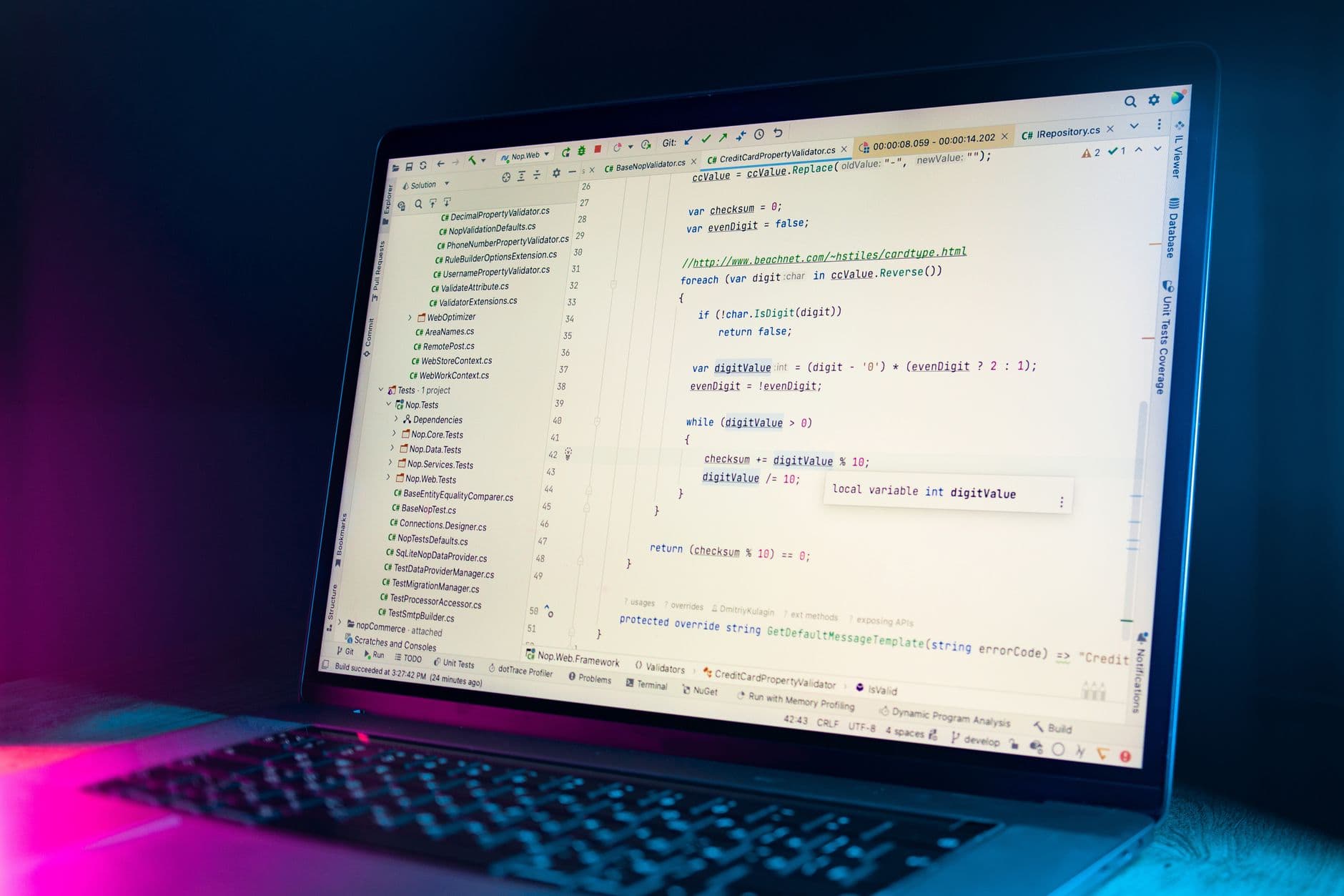
Photo by Cup of Couple on Pexels
There is a measurable decline in efficiency when you turn a passive visual cue into an active search-and-rescue mission. When the scrollbar is invisible until 'needed,' the brain has to exert cognitive load just to find the navigation tool before it can even begin to navigate. It’s the digital equivalent of a building where the exit signs only light up after you’ve already found the door. It’s brilliant, really. Why make something discoverable when you can make it a reward for persistent clicking?
Consider the 'Jump Here' right-click feature. In Windows 95, it was a staple. You could teleport through a document with surgical accuracy. In the modern 'Fluent' or 'Material' design systems, the scrollbar is often so thin that right-clicking it is a high-stakes gamble. Half the time, you miss the bar entirely and end up right-clicking the background content, triggering a context menu you didn't want. It’s a masterpiece of anti-ergonomics.
Shaving the Yak for Minimalism
The irony is that this 'cleanliness' creates more visual noise, not less. Because the bars auto-hide, the entire layout of a page often shifts by a few pixels every time they appear and disappear. Text jumps. Images jitter. It’s a constant, microscopic earthquake on your monitor. But at least when you aren't moving your mouse, the window looks like a high-end Swedish furniture catalog. And isn't that what we're all really here for? We aren't trying to finish spreadsheets; we're trying to maintain a vibe.
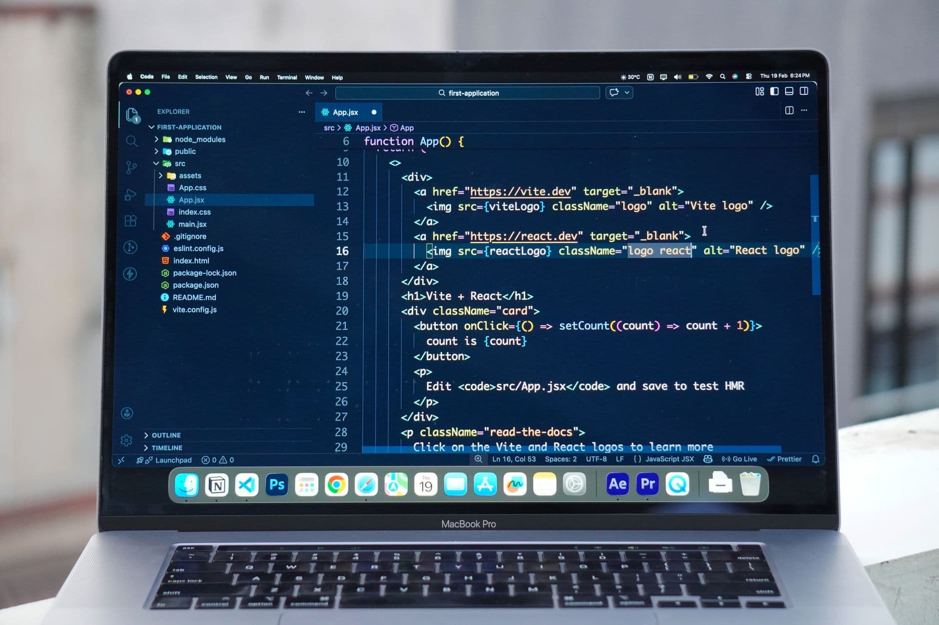
This trend is part of a broader philosophy that suggests 'pro' features are an embarrassment. If a feature isn't used by 99% of grandmothers checking their email, it should be buried three menus deep or removed entirely. The fact that a power user could navigate a 10,000-line codebase 40% faster with a persistent, interactive scrollbar is irrelevant. That power user is ruining the screenshot for the marketing team’s landing page.
We are now at the point where 'UI Affordances'—the little visual hints that tell you a thing can be clicked or dragged—are considered a legacy bug. We are being trained to click on everything and hope for the best. It’s exploratory computing, which is a very polite way of saying 'blind guessing.'
What This Actually Means
The 'Invisible Interface' isn't about making tools better; it's about making tools disappear so the hardware looks more like a lifestyle accessory. When a scrollbar hides, the screen looks like a continuous piece of glass. It’s a hardware salesman’s dream and a data entry clerk’s nightmare. We have prioritized the 'unboxing experience' over the 'eight-hours-a-day-at-a-desk' experience.
This loss of discoverable shortcuts is a slow-motion lobotomy of user proficiency. As we remove the visual anchors of our software, we stop learning how the software actually works. We become passive scrollers rather than active navigators. We are no longer driving the machine; we are just swiping at the ghost of a machine and hoping it responds to our touch.
Ultimately, the decline of the scrollbar is a canary in the coal mine for the death of the 'Power User.' If we can't even be trusted with a permanent gray bar on the side of our screen, we certainly can't be trusted with complex file systems or customizable toolbars. But hey, at least the empty white space looks really expensive while you're struggling to find page 42.
Quick Answers
Why did they change the scrollbars in the first place?
Because mobile phones don't have mouse cursors, and designers decided that your 32-inch desktop monitor should behave exactly like a 5-inch slab of glass for the sake of 'consistency.'
Can I get my old, chunky scrollbars back?
In most modern operating systems, you have to go into Accessibility settings and toggle 'Always show scroll bars,' because being able to see your tools is now considered a specialized need for the visually impaired.
Is there actually a 'shortcut' I'm missing?
Yes, in classic Windows, right-clicking any point on the scroll track allowed you to 'Scroll Here,' but in many modern apps, the 'track' doesn't exist until you're already dragging the 'thumb,' making the shortcut a logical paradox.