Modern digital life is trapped within the confines of the 'Geometric Sans' era. For the past decade, every major tech conglomerate has retreated into a safe, sterile visual language—think of the transition from Google’s quirky serif to its current, rounded Product Sans, or the way every startup now looks like a clone of a clone. This is not merely a design trend; it is a psychological flattening. It suggests that the internet is a finished product, a frictionless utility where nothing unexpected is allowed to happen.
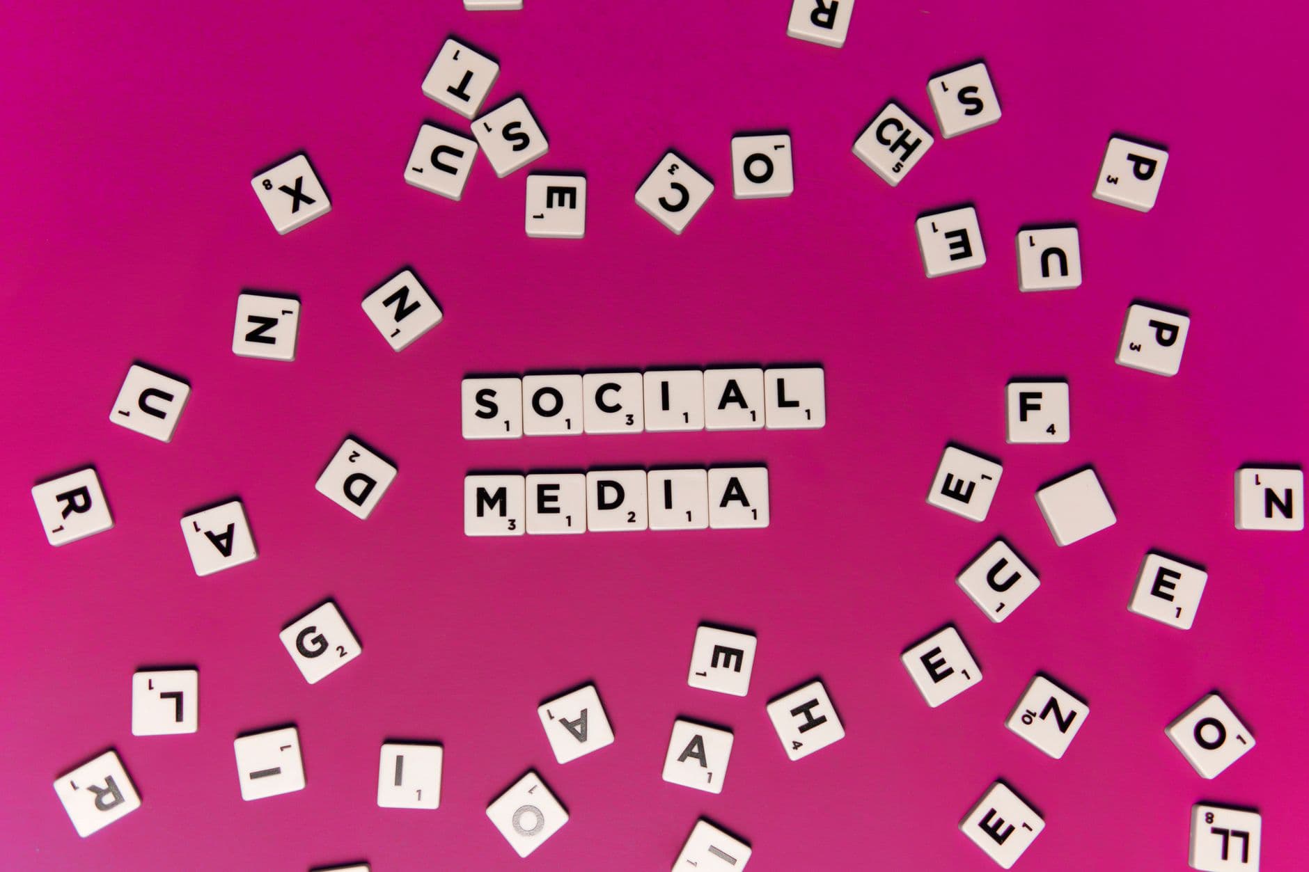
When projects like 'Times New Bastard' emerge—jostling the reader with unexpected serifs and inconsistent heights—they are not just internet memes. They are acts of digital sabotage. By intentionally breaking the rules of legibility, these designers are asserting that the human experience is messy, unpredictable, and fundamentally unmarketable. We are seeing the birth of a New Brutalism, one that prioritizes the friction of the individual over the efficiency of the platform.
The Architecture of Forced Efficiency
The current state of web design is governed by the 'User Experience' (UX) industrial complex. This discipline has one primary goal: to remove all resistance between the user and a transaction. To achieve this, designers have stripped away everything that makes typography expressive. Characters have been shaved down until they are indistinguishable, optimized for low-resolution screens and short attention spans. The result is a visual monoculture that feels less like a neighborhood and more like a sanitized airport terminal.
This aesthetic sterility serves a specific purpose. It communicates that the platform is neutral, objective, and authoritative. By using the same typeface for a news report, a targeted ad, and a personal message, the platform erases the context of the information. It creates a vacuum where the corporate identity is the only thing that remains visible. The pushback against this—the 'cursed' font—is an attempt to reintroduce context and personality into a space that has been scrubbed clean of both.
Sabotage as a Design Philosophy
There is a historical precedent for this kind of aesthetic revolt. In the late 1980s and early 1990s, designers like David Carson challenged the rigid grids of modernist design with Ray Gun magazine, proving that communication does not require perfect legibility. Today's cursed fonts are the digital heirs to that legacy. They utilize the very tools meant for precision—OpenType features and variable font weights—to create chaos.
- Inconsistency as Authenticity: By varying the baseline or width of characters randomly, these fonts mimic the errors of physical printing and human handwriting.
- Defiance of the Algorithm: Machine learning models trained on clean data struggle to parse distorted text, making these fonts a soft form of obfuscation.
- The Return of the Amateur: They celebrate the 'ugly' web of the 1990s, where personal expression outweighed corporate brand guidelines.
Consider the $250 billion global advertising market, which relies on the ability to deliver clear, instantly digestible messages. When a subculture adopts a font that is intentionally difficult to read, they are effectively opting out of that economy. They are creating a space where the act of reading requires effort, thereby ensuring that only those truly invested in the community will bother to engage.
The Reclaiming of Digital Agency
We must view the 'Ugly Web' rebellion as a symptom of a broader exhaustion with the commodified self. Every aspect of our digital presence—from our LinkedIn profiles to our Instagram feeds—is coerced into a professionalized, high-gloss format. We have become the curators of our own personal brands, and that labor is exhausting. The cursed font offers a reprieve. It is an aesthetic that cannot be easily monetized because it is fundamentally repulsive to the logic of the market.
By embracing the 'Times New Bastard' or the jagged, glitching scripts of the 'weird web,' users are building a digital landscape that looks like the people who inhabit it: flawed, loud, and complicated. This isn't about a lack of skill; it is about a refusal to use that skill in service of a boring, predictable world. It is an assertion that the internet belongs to the eccentric, not the shareholder.
What This Actually Means
The proliferation of cursed typography is the first step toward a more fragmented and interesting internet. As corporate platforms continue to consolidate and sanitize, the 'underground' will inevitably become more abrasive. We are moving toward a future where visual illegibility becomes a badge of honor—a way to signal that a piece of content was made by a human, for humans, without any regard for 'best practices.'
This movement suggests that we are finally bored with perfection. The 'clean' aesthetic has reached its logical conclusion, and it has nowhere left to go but toward the void of complete anonymity. By choosing the ugly, the broken, and the cursed, we are choosing to be seen. We are choosing a digital world that has texture, even if that texture occasionally draws blood.
In the end, the revolt against sans-serif minimalism is a revolt against the idea that our digital lives should be easy. It is a demand for a web that is as difficult, beautiful, and strange as the physical world it was meant to augment. The fonts are just the beginning.
Quick Answers
Is this just a passing internet trend?
No, it is a recurring historical cycle where rigid modernism is eventually overthrown by expressive, often chaotic, postmodern movements.
Why is minimalism considered 'corporate'?
Minimalism is cheap to scale, easy to localize, and projects a false sense of objective authority that benefits large institutions.
Do these fonts actually impact usability?
Yes, and that is the point; they prioritize the emotional impact and the community-building power of the 'inside joke' over universal accessibility.