Well, isn't this just a groundbreaking revelation? A new study involving 37,500 hand-drawn maps confirms what we've all secretly suspected: official borders are apparently less about immutable geographic truth and more about a collective, slightly fuzzy, memory exercise. It's almost as if human perception plays a role in, you know, human-made constructs. Mind. Blown.
The Shocking Discovery of Human Opinion
So, researchers asked a bunch of people to draw the world's borders from memory. And — prepare yourselves — the results weren't perfectly aligned with the meticulously surveyed, internationally recognized lines. Apparently, when you remove the authoritative hand of Google Maps, people tend to sketch out what they feel are the borders, which often correlate with cultural ties, historical grievances, or perhaps just a general sense of 'that country is kinda shaped like a boot, right?' This is truly a revolutionary finding, confirming that humans are, in fact, not perfect geospatial data rendering machines. My sincerest apologies to anyone who thought we were.
It gets even more fascinating when you consider that these discrepancies aren't just random scribbles. No, no, they often highlight regions of historical conflict, disputed territories, or areas where populations have shifted dramatically. It's almost as if people's lived experiences and collective narratives subtly warp their internal GPS. Who would've thought that something as fundamentally human as 'memory' would influence how we perceive something as fundamentally human as 'national boundaries'? It’s almost too subtle to grasp. Almost.
Official Maps: A Cruel Hoax?
For generations, we've been operating under the assumption that those crisp lines on the official atlases were, shall we say, definitive. Turns out, they're just highly persuasive suggestions, backed by centuries of geopolitical strong-arming and the occasional war. This new 'cognitive cartography' project, aptly dubbed the 'Anthropocene Map,' suggests that the real map of the world exists somewhere in the messy, inconsistent grey matter of billions of people. This is, of course, far more practical for international diplomacy and resource management than, say, a GPS-accurate satellite image. Because what's more reliable than 37,500 slightly off-kilter doodles?
And let's be honest, who needs the objective authority of a surveyor's transit when you have the subjective, often passionately held, opinions of... well, everyone? It really puts into perspective all those tiresome border disputes. Turns out, maybe both sides are just operating on different, equally valid, mental maps. We've been approaching this all wrong. Instead of treaties, we should just ask people to draw their preferred boundaries and then average the results. Problem solved. World peace, here we come.
The Flimsy Future of Fixed Lines
Now, layer onto this delightful chaos the rather inconvenient realities of climate migration and resource scarcity. As if national leaders didn't have enough to worry about, now they have to contend with the fact that their citizens might not even agree on where their country actually ends. Imagine trying to secure a border against, say, encroaching desertification, when half your population thinks the border is 50 miles further north, and the other half thinks it runs along a river that dried up last year. It’s a policymaker's dream, truly.
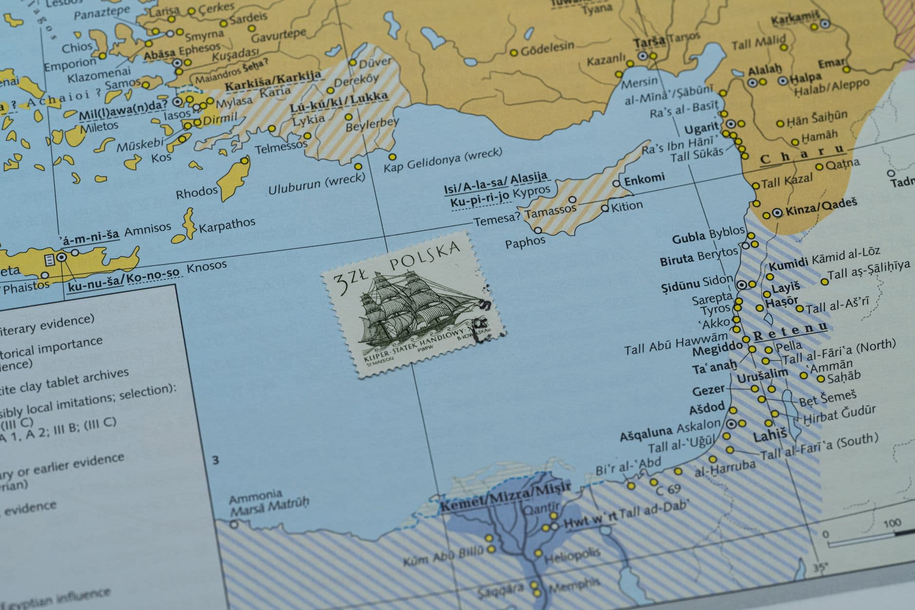
Photo by PNW Production on Pexels
This 'Anthropocene Map' concept isn't just a quirky art project; it’s a profound indictment of our collective delusion that borders are static. They never have been, not really. They shift with every war, every treaty, every colonial land grab, and now, apparently, with every person's slightly skewed memory. The only constant is change, and apparently, the only truly objective map is the one that accounts for billions of subjective interpretations. It’s almost poetic, in a deeply unhelpful way.
What This Actually Means
So, what's the takeaway from all this? That our meticulously drawn lines on official documents are, at best, a collective hallucination we've mostly agreed to indulge. At worst, they're a dangerous fiction, especially when real-world pressures like climate change and resource disputes are forcing populations to move and re-evaluate their relationship with the land. The idea of 'sovereignty' itself starts to look a bit shaky when its foundational premise – a clearly defined territory – is subject to the whims of human recall.
It means that perhaps, just perhaps, we should pay less attention to the 'objective authority' of maps and more attention to the 'subjective reality' of the people living within, or being displaced across, those lines. Because whether you're a government official or a climate refugee, your personal map of the world is, for you, the most real one there is. And denying that, apparently, is just bad cartography.
Quick Answers
- What is the 'Anthropocene Map'? It's a conceptual map derived from thousands of hand-drawn borders, revealing how human memory and perception often differ from official, surveyed national boundaries.
- Why does this matter for sovereignty? If people don't collectively agree on where a country's borders are, it complicates the very notion of a state's defined territory and its exclusive authority over it.
- How do climate change and migration fit in? As climate change forces populations to move, the discrepancies between official borders and people's mental maps could exacerbate existing tensions and create new ones, making border management even more complex.
- Is this study saying official maps are wrong? Not exactly. It's suggesting that official maps represent one, albeit dominant, view, while the aggregate of human memory offers a complementary, and often conflicting, 'map' that also holds significant social and political weight.