The Unexpected Softness of the CLI
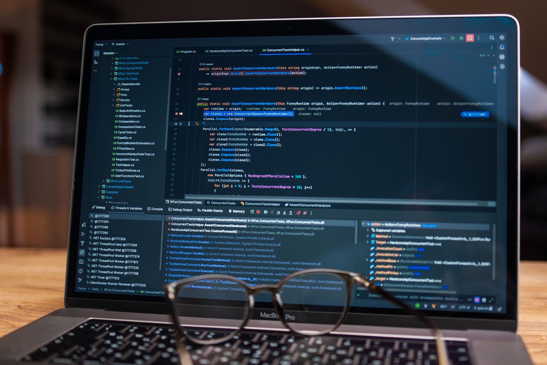
I’ve spent a lot of time lately looking at terminal user interfaces (TUIs) that look less like a hacker’s basement and more like a high-end boutique hotel lobby. Toast is the latest entry in this 'beautiful by default' movement, and it feels like a glitch in the matrix of traditional software engineering. For forty years, the terminal was a place of asceticism, a place where you proved your worth by navigating jagged edges and unreadable man pages. Now, we have rounded corners, pastel gradients, and shadows in a space that technically doesn't even have pixels—only character cells.
It makes me wonder if we’ve finally hit a breaking point with the 'ugly is efficient' lie. We’ve always treated developer tools like heavy machinery—oily, loud, and indifferent to your comfort. But if you're spending ten hours a day inside a terminal, why shouldn't it be beautiful? We buy ergonomic chairs and $300 mechanical keyboards to satisfy our tactile needs, yet we've been content to stare at the digital equivalent of a concrete wall. Toast and its peers are asking a question I didn't know I wanted answered: Can a code editor be a vibe?
The Psychology of the Aesthetic Workspace
There is a specific kind of mental friction that comes from staring at a cluttered, poorly designed interface. Designers call it cognitive load, but for developers, it’s usually just called 'Tuesday.' When I look at the layout of Toast, I see a deliberate attempt to lower the heart rate of the person using it. It’s not just about the colors; it’s about the hierarchy of information. By prioritizing the visual flow, these tools are treating the developer like a human being with a nervous system rather than a script-processing unit.
I’m curious if this shift is a direct response to the massive burnout numbers we’ve seen in tech since 2020. If your work environment is a chaotic mess of overlapping windows and jarring contrast, your brain is working overtime just to filter out the noise. There’s a theory in environmental psychology called Attention Restoration Theory which suggests that looking at pleasing, naturalistic patterns can actually help you recover from mental fatigue. Maybe a well-designed TUI is the digital equivalent of putting a plant on your desk.
Photo by Luna Lovegood on Pexels
Challenging the Cult of Minimalism
For the longest time, the 'minimalist' aesthetic in coding meant having nothing at all. You used Vim or Emacs because they stayed out of your way. But there’s a difference between a tool that is empty and a tool that is curated. Toast isn’t minimalist in the sense that it lacks features; it’s minimalist in the sense that it hides the complexity behind a layer of intentional design. It’s the difference between an empty room and a perfectly organized workshop where every tool is in a shadow board.
- Intentionality: Every border and padding choice feels like it was debated by someone who cares about balance.
- Accessibility: It turns out that 'beautiful' often overlaps with 'readable,' making it easier for new devs to hop in without a month-long hazing ritual.
- Identity: We are seeing the rise of the 'curated' terminal, where your setup is a reflection of your personal taste, not just your proficiency with shell scripts.
Is it possible that we’ve been wrong about utility this whole time? We used to think that beauty was a distraction from the work. Now, it seems like beauty might be the thing that makes the work sustainable. If a tool makes you feel calm, you’re probably going to write better code. Or at the very least, you won't want to throw your monitor out the window by 3:00 PM.
What This Actually Means
We are moving into an era of 'Software as a Sanctuary.' The lines between consumer-grade design and professional-grade tooling are blurring because the people using the tools are the same people who expect their iPhones and $2,000 coffee makers to look incredible. We’ve stopped accepting that 'work' software has to be miserable to look at. This isn't just about aesthetics; it's a structural shift in how we value the mental health of the person behind the keyboard.
If Toast and the 'beautiful TUI' movement succeed, it will force the legacy giants to rethink their approach. We might see a world where even the most hardcore backend tools start caring about typography and negative space. It sounds frivolous until you realize that we spend more time looking at these interfaces than we do looking at our own families. We deserve to look at something that doesn't hurt.
Ultimately, I don't think this is a trend of 'dumbing down' the terminal. It's a trend of 'humanizing' it. We are finally admitting that we aren't machines, and that the environment we inhabit—even the digital ones—matters deeply to our ability to think clearly. I'm excited to see where this goes, even if it means my terminal eventually looks better than my actual living room.
Quick Answers
Is Toast just a reskinned version of existing editors?
It’s a ground-up reimagining of the terminal IDE experience that prioritizes a cohesive, 'out of the box' aesthetic over the DIY configuration nightmare of older tools.
Do these visual flourishes slow down performance?
Surprisingly, no. Most modern TUIs use GPU-accelerated rendering via libraries like Charm’s Bubble Tea, meaning they stay snappy even with all the eye candy.
Why is this happening now?
As developer tools become more crowded and complex, design is becoming the primary way to differentiate products and reduce the mental fatigue of modern full-stack engineering.