The Mercator Convenience Store
For centuries, we’ve collectively agreed to pretend the world looks like a flattened toilet paper roll because it made it easier for 16th-century Europeans to navigate wooden ships. The Mercator projection is a masterpiece of imperial convenience, stretching the top and bottom of the globe until Greenland looks like it could swallow Africa whole. It’s a wonderful tool if you’re trying to sail a galleon to the West Indies, but it’s a bit of a problem when you’re trying to count how many coral reefs actually exist near the equator.
We spent the better part of the last fifty years wondering why our conservation efforts felt like trying to cover a king-sized bed with a hand towel. The math didn't add up because the pictures were lies. We looked at our maps, saw a tiny sliver of blue near the equator, and budgeted accordingly. It turns out that when you stop using a map designed to preserve straight lines for compasses and start using one that respects the actual physical surface area of the planet, the tropics suddenly expand like a cheap sponge in a bucket of water.
The Thirty Percent Surprise
Recent shifts toward the Equal Earth projection have revealed a shocking, high-level scientific secret: the equator is large. By moving away from the Robinson and Mercator distortions, researchers discovered that equatorial biodiversity hotspots were underestimated by as much as 30%. That isn't a rounding error. That is millions of square kilometers of reef, seagrass, and carbon-sequestering mangroves that were effectively invisible to the people writing the checks because they didn't fit neatly on a classroom wall chart.
Imagine running a global shipping company and suddenly realizing 30% of your fleet is invisible because you’re looking at them through a funhouse mirror. That is the current state of marine conservation. We’ve been allocating billion-dollar 'Blue Economy' funds based on a visual bias that makes Europe look grand and the Maldives look like a typo. Now that the Equal Earth projection has forced us to acknowledge that the middle of the planet is actually the widest part, the sudden scramble for funding is nothing short of comedic.

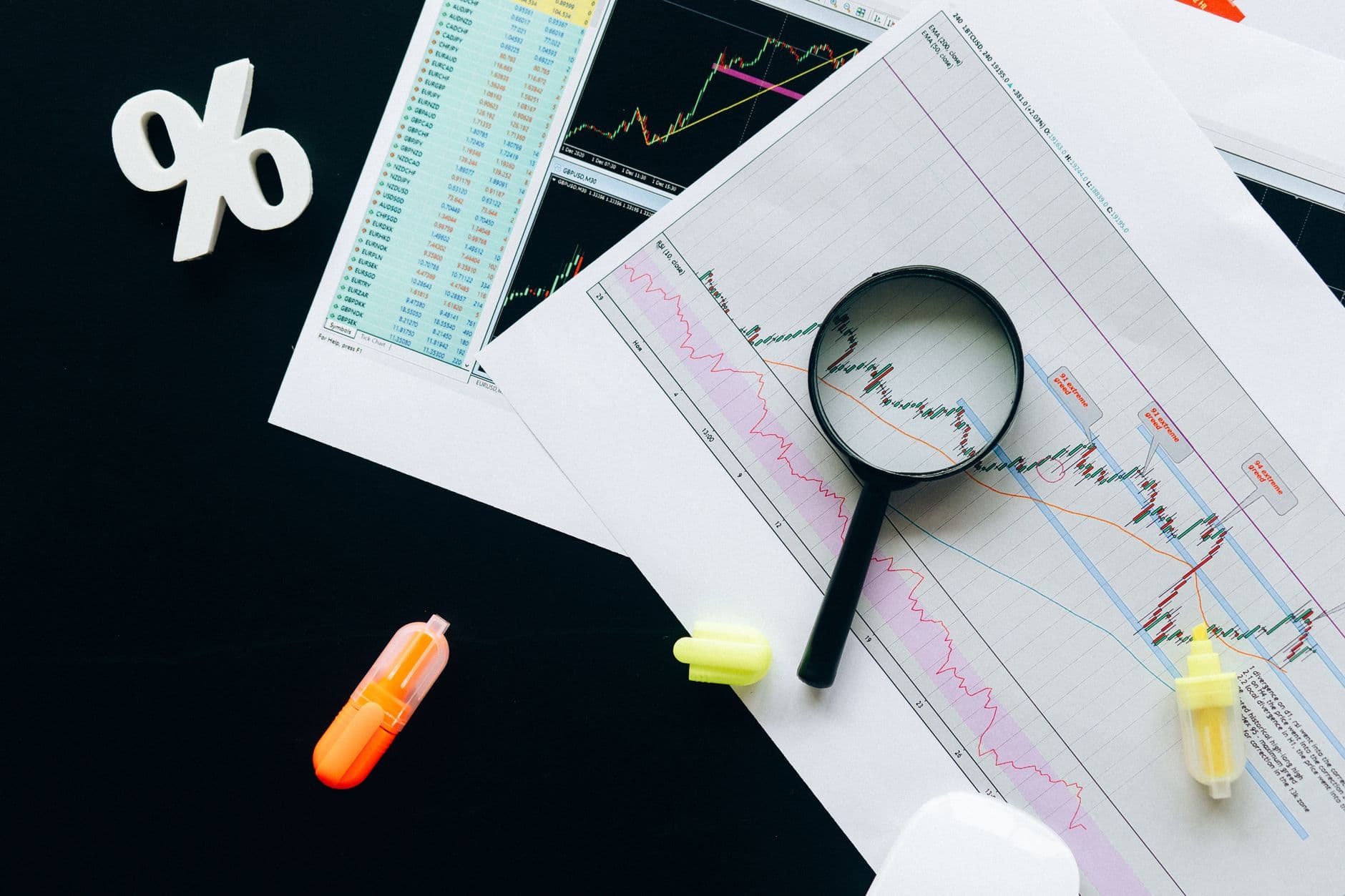
Photo by Nataliya Vaitkevich on Pexels
Funding Follows the Pixels
International oceanic protection funding is traditionally a game of spreadsheets and optics. When the optics change, the spreadsheets have a nervous breakdown. Organizations that spent years patting themselves on the back for protecting '10% of territorial waters' are waking up to realize they’ve actually only protected about 7%, because the denominator just got a whole lot bigger. The 'Equal Area' mandate isn't just a win for cartographic nerds; it’s a nightmare for bureaucrats who already spent their 2024 budgets.
We are now witnessing a 'data-driven reallocation,' which is polite-speak for 'we realized we ignored the most important parts of the ocean because they looked small on the wall.' Money is being clawed back from higher-latitude projects to cover the massive, newly 'discovered' expanses of the Coral Triangle. It’s almost as if the physical reality of the planet should have been a factor in environmental policy from the start, rather than an afterthought triggered by a change in map software.
What This Actually Means
This entire saga proves that humans are remarkably visual creatures to a fault. We can have all the raw satellite data in the world, but until we drew a map that didn't make Brazil look smaller than Alaska, we simply couldn't wrap our heads around the scale of the task. We treated the most biodiverse regions of our planet like the fine print at the bottom of a contract—mostly because that’s literally where they were positioned in our mental models.
Moving forward, we get to enjoy the irony of 'discovering' land and sea that has been there for four billion years. The Equal Earth projection didn't create more coral; it just stopped us from lying to ourselves about how much we were ignoring. It’s a sobering reminder that our 'scientific' priorities are often just a byproduct of which distorted image we decided to hang in our hallways.
If we can lose 30% of the tropics just by using the wrong projection, one has to wonder what else we're missing because the UI of our existence is poorly designed. Perhaps next week we'll find a forgotten continent behind the couch cushions of the South Pacific.
Quick Answers
Did the ocean actually grow?
No, the Earth remains the same size it was yesterday, but our ability to use a ruler on a flat surface has marginally improved.
Why does the map projection matter for money?
Global grants are often calculated per square kilometer; if your map says there are 1,000 kilometers and there are actually 1,300, you are underfunding the project by default.
Is the Mercator map 'evil'?
It’s not evil, it’s just a specialized tool for 1500s navigation that we’ve been using as a general-purpose reality simulator for far too long.