The Font That Ate The Skyline
I spent three hours yesterday looking at the kerning of the original Blade Runner title cards, and I’m starting to think we’ve been looking at urban planning all wrong. We usually talk about cities in terms of steel, glass, and concrete, but what if the most load-bearing element of a modern mega-city is actually the typography? When Ridley Scott and David Dryer slapped those high-contrast, razor-sharp letters onto the screen in 1982, they weren't just introducing a movie; they were drafting a manual for how light should occupy space.
There is something almost predatory about that aesthetic. The letters don't just sit on the screen; they cut into it. This "Typography of the Street" has migrated from the cinema screen to the actual streets of places like Chongqing, where the architecture seems to exist primarily as a scaffold for massive, glowing characters. It makes me wonder: did we build these cities to house people, or did we build them to give these giant digital alphabets a place to live?
Verticality and the Loss of the Horizon
In a traditional city, you look across. In a cyberpunk city, you only look up. This shift in perspective changes the way information has to be delivered to our brains. If you’re standing at the base of the Raffles City complex in Chongqing—a structure that cost roughly $3.4 billion to realize—your field of vision isn't dominated by the stone or the windows. It’s dominated by the vertical hierarchy of signage.
- The top tier is for the global brand, visible from three miles away.
- The middle tier is for the regional anchor, guiding you toward a specific district.
- The street tier is a chaotic soup of low-res LED flickers.
This isn't accidental. It’s a direct translation of the filmic technique where the title card establishes the scale of the world before you even see a character. Architects are now designing "media facades" before they even finalize the floor plans. I find it fascinating that we’ve reached a point where the light emitted by a sign is considered a structural material, just as vital as the rebar holding up the floor.

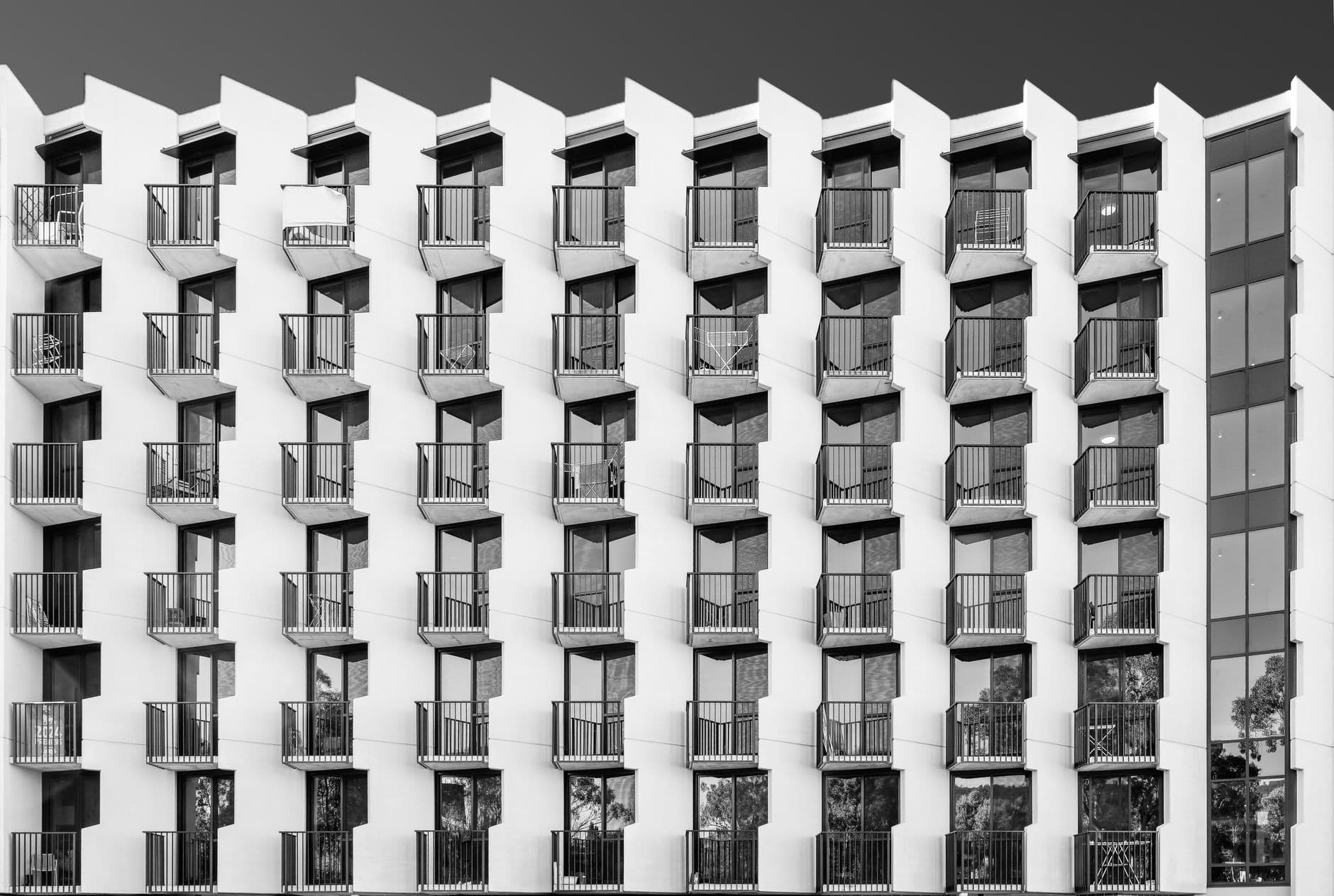
Photo by Nothing Ahead on Pexels
The Psychology of the High-Contrast Glow
Why does this specific look—the harsh white or neon pink against a deep, suffocating black—feel so much like "the future"? It’s been forty years since the movie came out, yet we haven't moved on. Maybe it’s because high-contrast typography mimics the way our eyes work in a state of overstimulation. When there is too much noise, we look for the sharpest edge.
I’m curious if this aesthetic actually makes us feel more or less at home. On one hand, the bold signage acts as a lighthouse, a wayfinding tool in a city that is too big to memorize. On the other hand, it turns the inhabitant into a background extra. When a glowing kanji character is forty stories tall, the human being at the sidewalk level becomes mathematically insignificant. We are literally living in the margins of a giant, glowing book.
There’s a specific date that sticks in my mind: November 2019. That was the month and year the original Blade Runner was set. When that date actually rolled around, I looked at photos of the Shinjuku district in Tokyo and realized the fiction had lost. The reality was more "Blade Runner" than the movie itself. The movie used physical models and matte paintings; the real world used millions of programmable pixels to create a liquid architecture that changes every time a contract for an advertisement expires.
What This Actually Means
We are witnessing the death of the facade as a static object. If the graphic design of film titles influenced the first wave of cyberpunk urbanism, the next wave is going to be defined by the total integration of data and dirt. We’re moving toward a world where a building isn't finished until it’s been wrapped in a skin of light that tells you what to buy, where to go, and how to feel.
I don't think this is necessarily a nightmare, though it's often framed that way. There is a strange, shimmering beauty in a city that communicates its own identity through light. It’s a type of communal storytelling. But I do wonder what happens to our sense of place when every city on earth starts using the same font, the same glow, and the same vertical hierarchy. If every city is a title card, where does the actual movie start?
Ultimately, the typography of our streets tells us who is in charge. In the medieval city, the tallest thing was the cathedral spire. In the industrial city, it was the smokestack. In our cities, it’s a high-contrast digital display. We’ve built a world that looks like a movie set, and now we’re just trying to figure out if we’re the stars or the crew.
Quick Answers
Did a movie really change how cities are built?
Not in a literal "architects watched a DVD" way, but it provided a visual vocabulary that developers and planners adopted to signal "modernity" and "high-tech status."
Why are Tokyo and Chongqing always the examples?
These cities embrace verticality and multi-layered transit more than Western cities, making them the perfect canvases for the stacked, typographic look of sci-fi.
Is this trend going away?
Unlikely. As LED technology becomes cheaper and more flexible, the "screen-as-a-building" trend is actually accelerating in emerging mega-cities across Asia and the Middle East.