The Great Un-Sleekening
Let’s be honest, the internet has become a terrifyingly beige place. Every website, app, and digital interface screams “professionalism” with the subtlety of a foghorn. It’s all rounded corners, gentle gradients, and drop shadows so subtle they whisper. We've been force-fed a diet of digital tofu for so long, our aesthetic taste buds have atrophied. Enter neobrutalism, looking like it was designed by a robot who just discovered hammer smashing.
It's the digital equivalent of swapping your pristine white sneakers for construction boots. Black strokes thicker than my grandmother’s eyebrows, drop shadows that look like someone spilled ink, and layouts that appear to have been assembled with a crowbar. It’s glorious. It’s jarring. It’s… surprisingly refreshing. It’s like the web finally decided to stop apologizing for existing and just sort of… is.
From Post-War Angst to Pixelated Angst
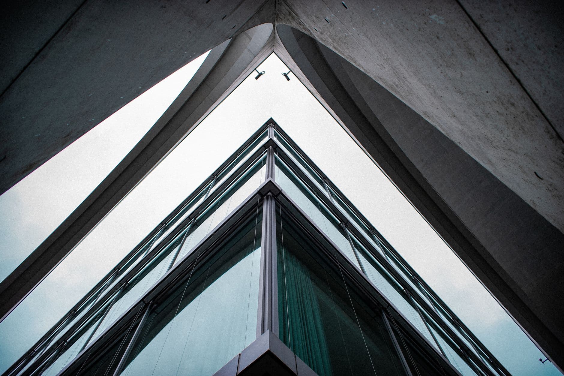
The original brutalism in architecture, born from the ashes of WWII, was all about honesty. Raw concrete, exposed structure, no frills. It was a defiant middle finger to the shiny, corporate glass boxes that were supposed to signal progress. It said, “Yeah, this is concrete. Deal with it.” Now, neobrutalism on the web is doing the same thing. It’s rejecting the sterile, overly-curated perfection that’s become the norm. It’s the digital equivalent of showing up to a black-tie gala in a band t-shirt and combat boots.
Think about it. We’re drowning in content. We’re bombarded with perfectly optimized, endlessly scrollable feeds. We need something to snap us out of it. Neobrutalism is that splash of ice water. It’s the digital equivalent of a car alarm going off in a library. Annoying? Maybe. Effective? Absolutely. It forces you to pay attention. It says, “I’m here, I’m clunky, and I might just be more interesting than that perfectly symmetrical, soulless icon.”
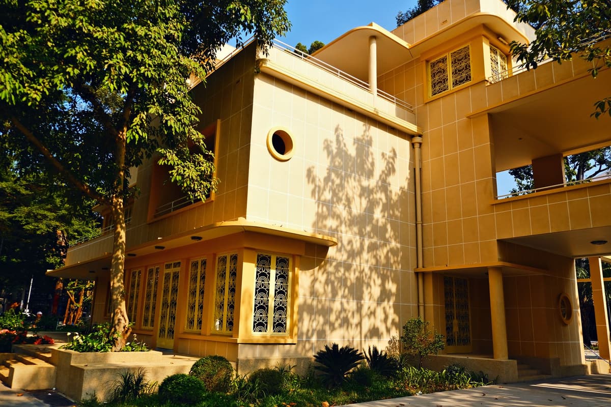
Photo by Lê Quang Thành on Pexels
Is Your Website Feeling a Little Too… Polite?
This isn't just about looks; it's about a vibe. Neobrutalism is the digital world’s collective yawn at the relentless pursuit of “user-friendliness” that often translates to “utterly forgettable.” It’s a rebellion against the idea that every digital interaction needs to be as smooth and frictionless as possible. Sometimes, a little friction is good. It makes you feel alive. It makes you remember you’re interacting with something designed by a human (or at least, a human-adjacent AI with a penchant for dramatic shadows).
Imagine trying to navigate a website that looks like it was built in 1998, but with a modern, edgy twist. It’s like discovering your grandma’s secret stash of vintage rave flyers. Unexpected, slightly chaotic, and surprisingly cool. It breaks the monotony. It dares to be a little ugly, and in doing so, becomes beautiful in its defiance. It’s the digital equivalent of a perfectly placed, slightly off-key musical sting.
The Concrete Jungle, Reimagined
Architecturally, brutalism was often criticized for being… well, brutal. Cold, imposing, intimidating. But it also had a raw power, a statement of intent. Neobrutalism online is similar. It can be harsh, it can be overwhelming if done poorly. But when it works, it’s incredibly powerful. It cuts through the noise. It demands your attention.
We’ve spent years chasing that minimalist dream, that clean, uncluttered aesthetic. And it’s lovely, truly. But after a while, it starts to feel a bit like living in a hotel room. Perfectly functional, utterly bland. Neobrutalism is the messy, paint-splattered, slightly-too-loud roommate you never knew you needed. It’s the digital equivalent of a screaming goat meme – you don’t quite know why, but you can’t look away.
What This Actually Means
Ultimately, neobrutalism is a symptom of our collective fatigue with the predictable. We’re tired of the same-old, same-old. We crave something with a bit of edge, a bit of personality, even if that personality is a bit rough around the digital edges. It’s a sign that designers and users alike are ready to break free from the tyranny of bland perfection.
So, next time you see a website with aggressive black lines and shadows that could stop traffic, don't recoil in horror. Embrace it. It’s the internet’s way of saying it’s still got some fight left in it. It’s the digital world’s concrete jungle, and frankly, it’s about time we built something interesting in it.
Quick Answers
What exactly is neobrutalism?
It's a web design style featuring bold black outlines, stark shadows, and often a limited, high-contrast color palette, drawing inspiration from brutalist architecture. Think digital concrete.
Why is it suddenly popular?
People are tired of overly polished, generic designs. Neobrutalism offers a more raw, attention-grabbing, and personality-driven aesthetic that stands out.
Is it hard to implement?
It can be, especially if you're aiming for intentionality rather than just chaos. It requires careful use of contrast, spacing, and typography to avoid looking like a mess.
Will it last?
Like all design trends, probably not forever. But its impact in pushing back against blandness might stick around, influencing future aesthetics.